
Personal Website Build for a University Professor
A professor from Westminster University, was referred to me since he needed a personal website built to showcase his work and plan events.
He asked for guidance on how to set up a website, to be instructed on how a website is built, and design expertise to add a creative element.
August 2021 - September 2021
Major Stakeholders
The Professor
Students
Lecture Attendees
Book Readers
My Role
Product Design, UX, User Interaction, Visual design, Prototyping
This project was completed independently and remotely.
Tools Used
Sketch, Photopea, Wix
Scope and Constraints
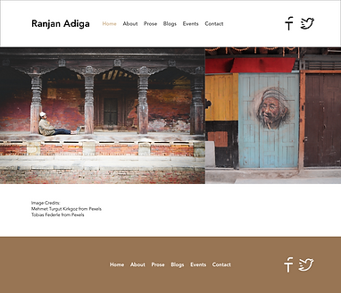
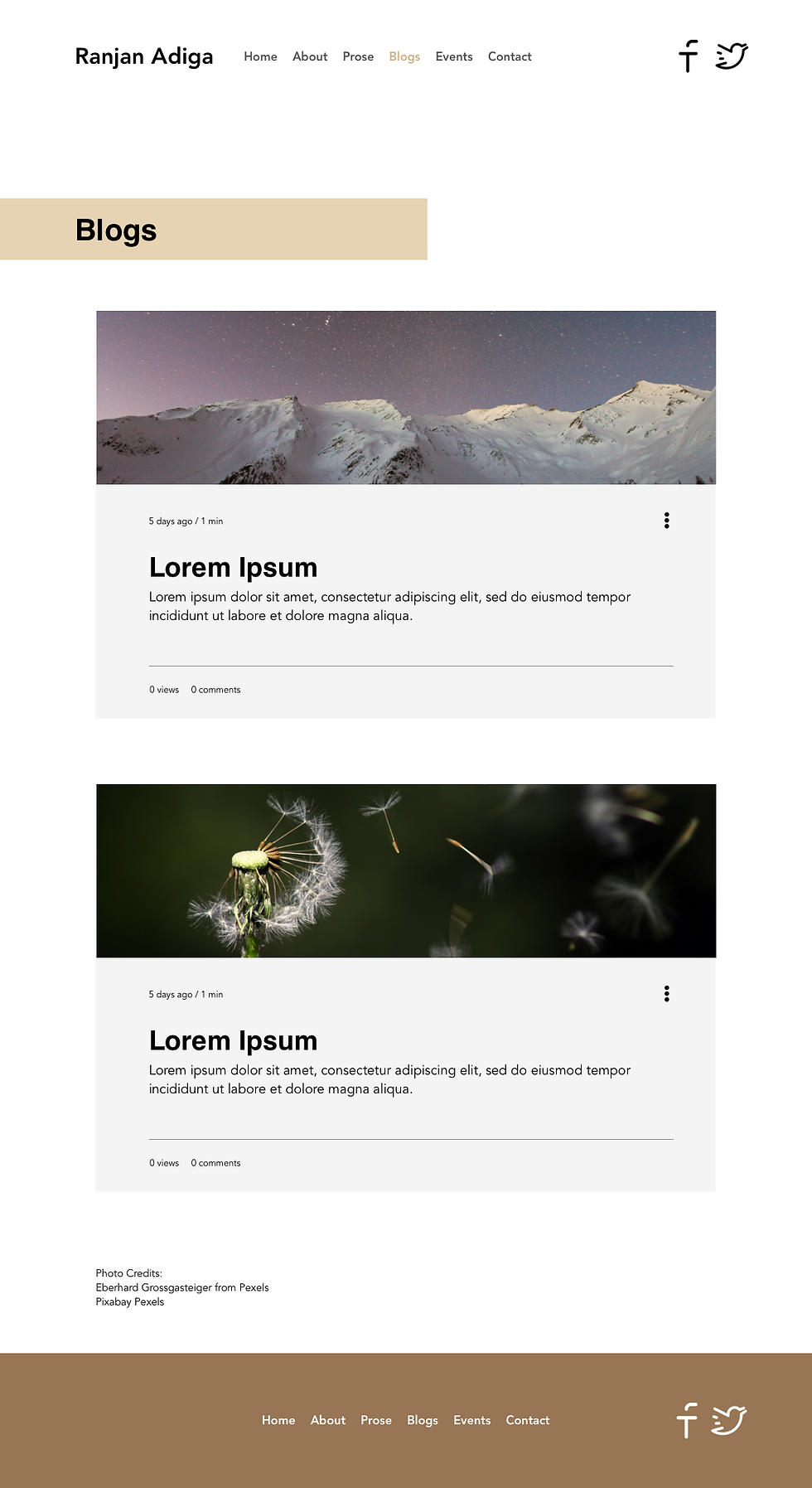
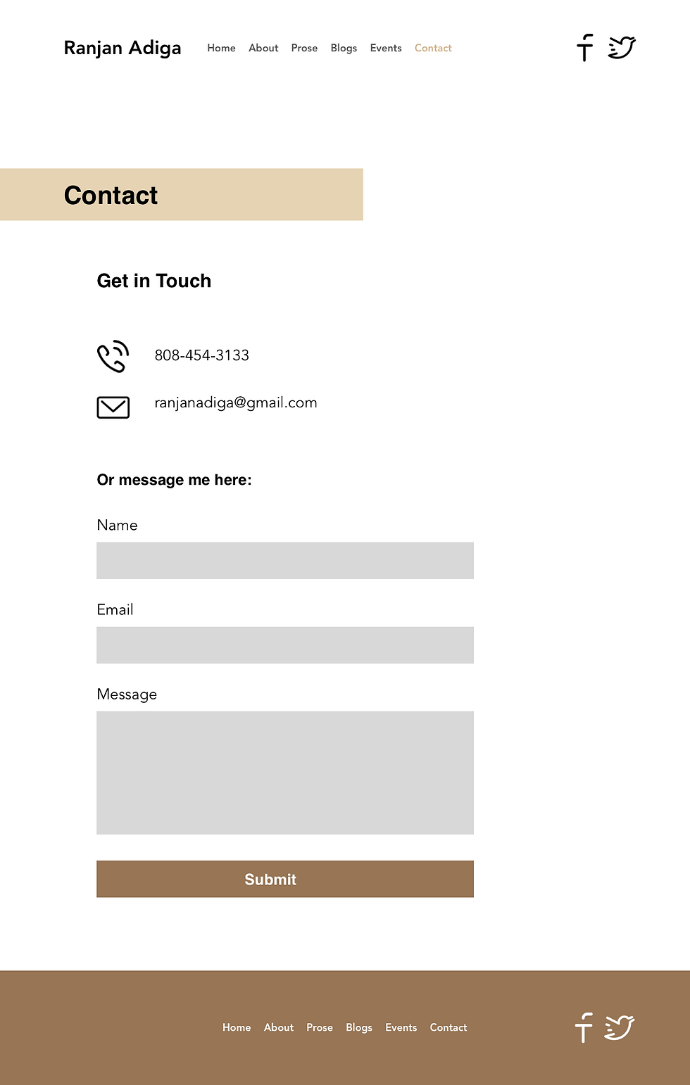
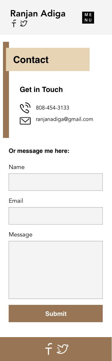
When my client asked me to design his website, he wanted it to be very black & white, minimalistic, and simple. It needed to be stripped down to the minimum with only a small amount of accenting detail.
I had no time frame to complete this project, and my client already had an idea of what content needed to be included. The only constraint was my client's limited knowledge of the website building process, which I was able to walk him through and teach him the fundamentals.
First Prototype
To give my client a clear picture of what I had in mind for his design, I provided full color prototype images from Sketch to start off. This is because I hoped to communicate a strong understanding of what the desktop version would look like.
I experimented with different ideas that he might like to put on the home page since he wasn't initially sure what to include.
Final Prototype
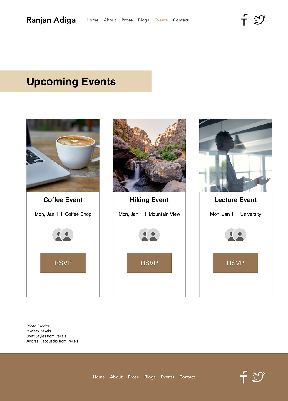
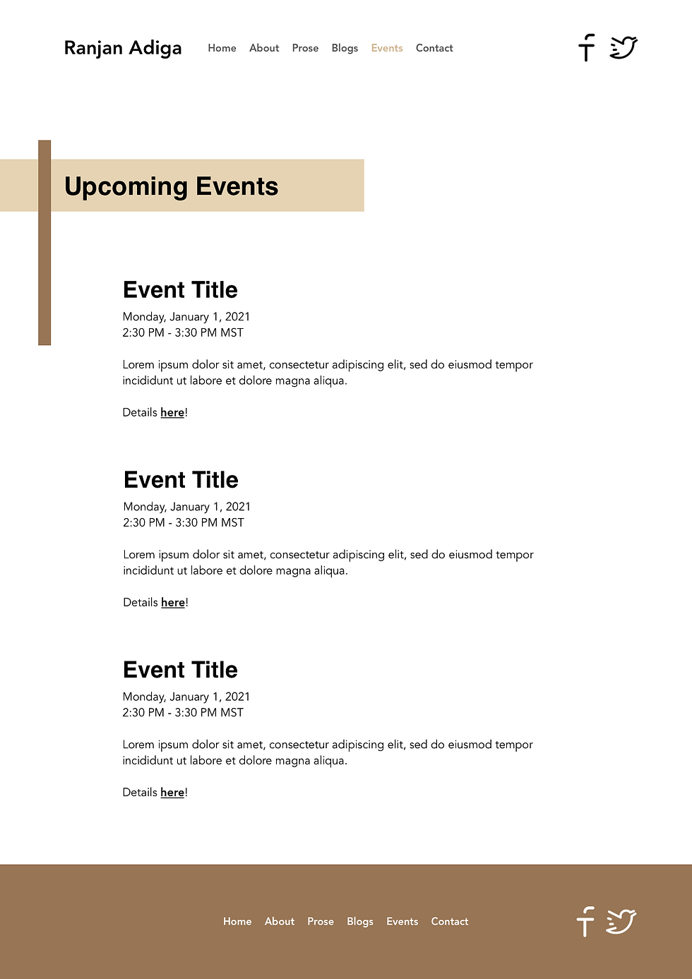
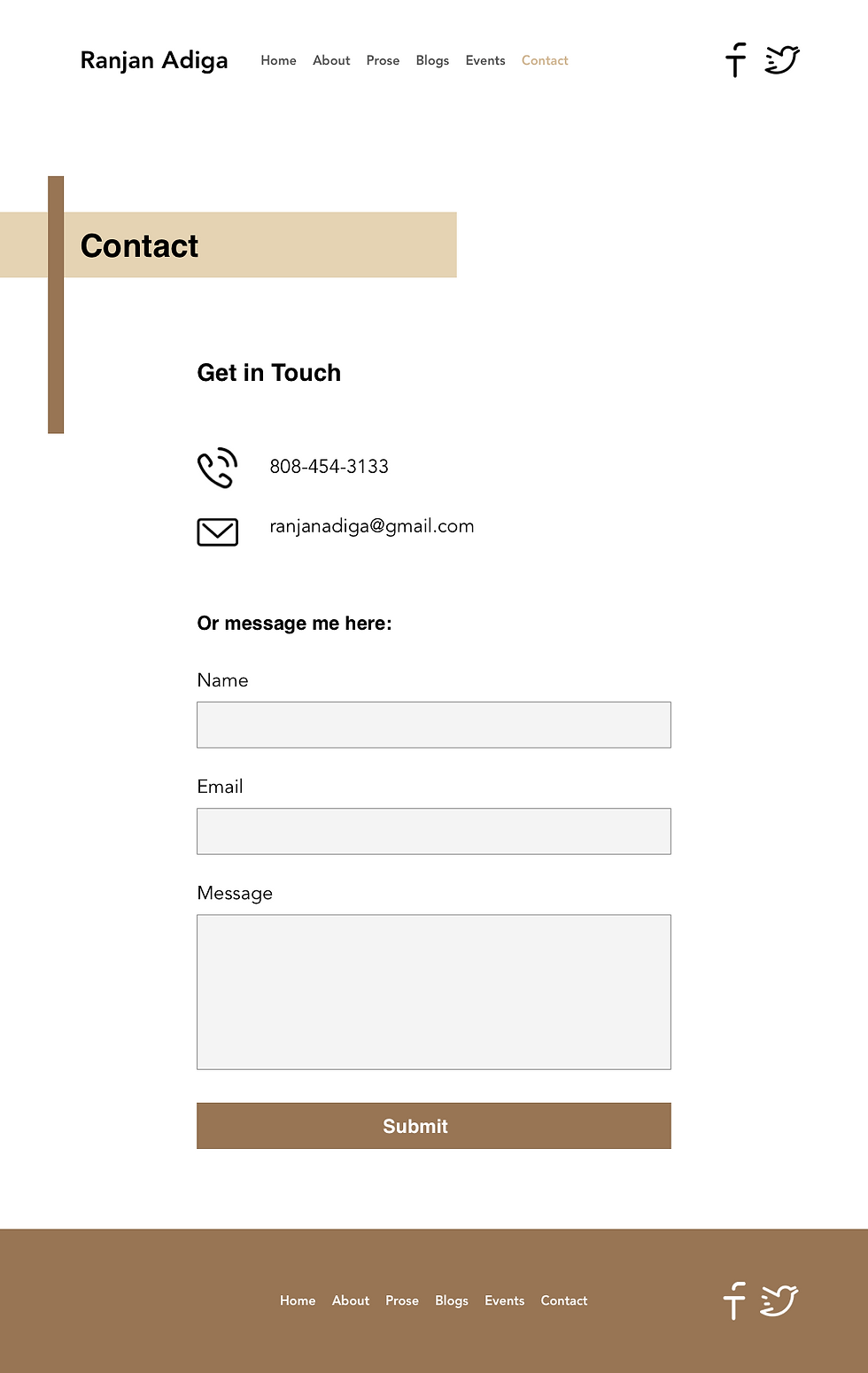
After the first two iterations, the filler pictures and the extra ideas were more than the client wanted. They gave him the impression that they would be included in the final publishing, which was not what I'd intended as I was still experimenting. So to simplify it further for him, I only included the items that he initially asked for and reformatted some of the features like the Events page to be more straight forward.

Concerns
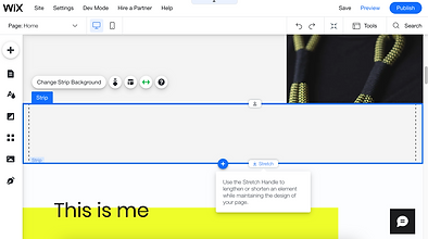
Since the images from Sketch I sent to my client weren't changeable for him, he had concerns with how he would be able to make his own changes when I'd finished building the website.
I explained that I had set up his Theme Manager for him so that he can keep the design looking consistent. I also showed him how Strips work in Wix and reassured him that new content can easily be added at any time. Showing him with visual examples cleared up the doubts he was having.


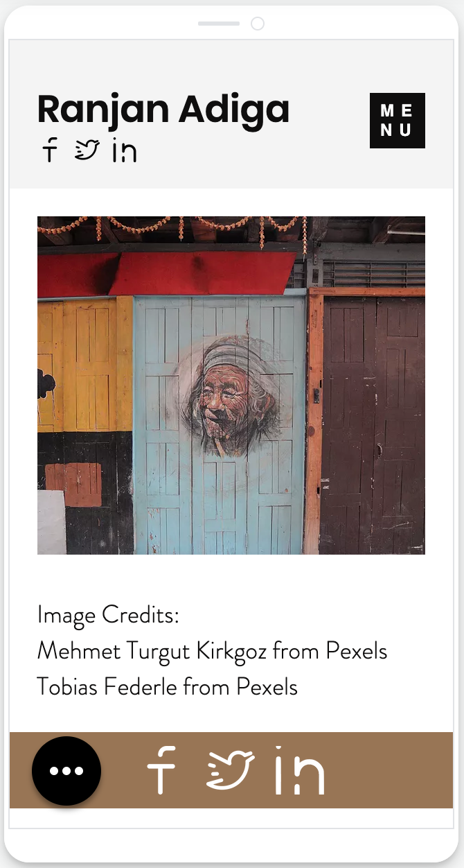
Mobile Prototype
While I'd usually like to develop the mobile version of the prototype first in order to condense the needed content for the site and make sure the design is phone compatible and resizable, this client's case was different.
The theme he wanted was already really trimmed down, and he was a novice with technology. I saved the mobile version for last so that he understood I was making him a website instead of an app, and so that he could see the whole design at once first before seeing the small mobile presentation.

Outcomes
I achieved my goals of:
-
Assisting my client in understanding the website building process
-
Designing a website that fit the client's desired requirements
-
Building the website and teaching my client to make his own modifications
Results
I gained great experience communicating with a client who wasn't tech savvy and also needed things to be explained in different ways. My client was a very visual learner who responded better to demonstration over a shared screen Zoom call than through descriptive email or text like I usually use with my clients.
This project took me in a different direction by focusing on slimming down rather than adding more visual appeal. For example, my previous clients have all desired more pictures to show off their content. With my client, the stock photos used as examples threw him off. Taking away the color and pictures had him feeling a lot better about the final design.